Scout: An online food directory that makes Food Exploring more fun for the users
UI/UX Case Study

About Me
As an aspiring self-taught Product Designer with experience in graphic design, I have spent the last four years honing my skills in visual communication and design thinking.
Disclaimer
This case study is based on a personal project and is not affiliated with any company or organization. Any resemblance to real-world projects or clients is purely coincidental.
Introduction
In today’s digital era, the only way to see what a restaurant offers is by using a printed menu card at the restaurant or search in google to find the menu in the images uploaded by other users. The other way might be searching the restaurant’s profile in food delivery apps such as Zomato, Swiggy, etc.
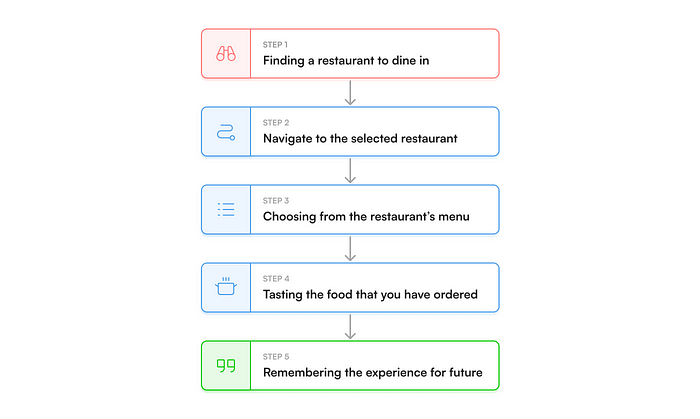
Food Exploration is still old fashioned —
- You might find new restaurants or cuisines by travelling around.
- Some people could suggest to you new locations or foods to try.
- Some influencer shares opinion about a restaurant or a cuisine in social media.
Understanding the problem space
People often struggle to find new and exciting dining experiences that meet their needs and preferences and may rely on outdated or unreliable sources of information.
As a result,
- They may miss out on great restaurants or cuisines.
- They might end up having something out of their preferences or from their dietary restrictions
- Waste time and money on subpar dining experiences.
I wanted to make a convenient way for people to discover and learn about new restaurants and cuisines, so these where the key objectives of this project

- Discovery — An easier way to discover new cuisines and dining experiences.
- Recommendations — Recommendations based on the users’ preferences, past dine-out activities and dietary restrictions.
- Favorites and Wish-list manager — This allows users to organize their favorite restaurants and cuisines, also they can add the restaurants & cuisines that they want to try into their wish list.
Design process and challenges
The first major challenge was, how to make a person fancy for a food or a restaurant. Following a competitive analysis with apps such as Swiggy, Door Dash, I was convinced that
visual representation was the best way to make a user fancy for a cuisine or dining experience that they have never tried!
As a result, images of cuisines & restaurants were given more prominence in the visual order and space.
After doing multiple iterations of the design of user-interface elements, I’ll be explaining my challenges and justifying my design choices.

I. Discovery and Exploring
One of the most difficult challenges was assisting customers in discovering new restaurants and cuisines based on their preferences and dietary needs. After conducting some competitive research, I’ve identified a few strategies for increasing the discoverability of new cuisines and dining experiences.

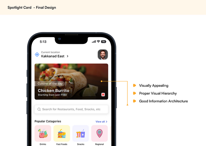
1. Spotlight Card
These are personal mini kiosk displays, that changes based on users past dining experience, location, suggestions from wish list, etc.

Most changes were on visual hierarchy and text legibility. After 5–6 major iterations, the card was more visually appealing, compared to its predecessors. I have settled on with the final design shown below:

The most prominent feature of the Spotlight Card is that they are adaptive. They can be used to
show popular dish in that location, remind the cuisine that you saved in your wish list, shows the restaurant that you are currently in to quickly access the profile, suggest you a new dish that you have not tried or even and unavoidable offer.
So, I made some variations of Spotlight Cards for these use cases.

2. Quick Search Bar
This helps to quicky find a restaurant, cuisine or snacks with one tap from the explore screen. After going through many iterations and competitive analysis, the end solutions were:

- Filtering: This will enable users to quickly filter based on their needs. For example, if the user just looking for restaurants, then they can select “Restaurant only” in the filter options.
- Sorting: To quickly sort the results by Rating, Nearby, Popular.
- Turn off Scouting: Here, Scouting refers to the personal filtrations done by the app. The user can opt out of this filtering any time for edge cases. E.g., If the user is looking for a cuisine for his/her friend. More on Scouting later.
- Listing Restaurants based on the search term: This section shows restaurants with the particular Cuisine or Food available. E.g., When you search for “sushi”, this shows Restaurants with Sushi in their menu.
- Result Cards: Provides relevant information about the search results, the variations are shown below:

II. Curation of Cuisines
Aside from discovery, curation of cuisines was another big challenge. I had to figure out how people choose a cuisine to dine out. So, the main ways were:
- They maybe following a diet by themselves or a prescription from a doctor
- They may not like a specific ingredient in their dish, e.g., I don't like Soy Sauce in any of my food.
To solve this issue, the app has an onboarding experience which lets the users choose whether they follow any kind of dietary restrictions or any ingredients they want to avoid in their cuisines.

I sorted out the dietary restrictions that most common and displayed as chips that the user can select when they are creating an account. Similarly, the users have the option to select the food ingredients that they are allergic to that they what to avoid.
This data can be used for Scouting, that was mentions
For Cuisines:
For each food details page, they can view ingredients easily just by a tap of a button. Also, the ingredients are divided into two sections: Main ingredients & other ingredients. This helps user to make a second thought before having the cuisine.

The user has the option to add the cuisine to their favorites or their wish list from here. They also have an option to “dislike” the dish, so the system can learn what they don’t like and recommend fewer dishes like it.
III. Restaurant Details and their Social Proof
For the user to make a wise choice on a dining experience, the appropriate information must be provided thus, information architecture was therefore among the most crucial issues.
1.Restaurant Details
The solution was to use chips for primary information like price range, distance and ratings, and use a bottom app sheet for secondary information like facilities, contact details, open hours and address which the user has the option to view if necessary.

2.Rating and Reviews
Ratings and reviews provide credibility for the restaurants, and credibility helps to attract more customers. But the problem with ordinary review system is that
Some restaurants can boost ratings using spam & fake reviews, which can counteract the negative reviews resulting in gaining a competitive edge.
When doing competitive analysis, Google Maps solved this problem with a leveling system for the users. A similar system will solve the problem.
Based on the users use and experience in the app their level increases.

The gamification features in the app helps to keep user retention and credibility of the rating and reviews of the restaurants. The levels and level names are inspired by the Boy Scouts:
- Level 1 — Scout
- Level 2 — Tenderfoot
- Level 3 — Second
- Level 4 — First
- Level 5 — Star
- Level 6 — Life
- Level 7 — Eagle
IV. Digitalization of Menu
Even though ordering food from home has been simplified by Food Delivery companies such as Zomato, Swiggy, Door Dash, etc., The dine-out experience seems a bit outdated. That is, going to a restaurant, asking for the printed menu card & choosing a dish. It’s significantly difficult for folks who adhere to any dietary restriction or have allergies to any ingredients.

I’ve come up with a solution to this problem that presents the data in three dimensions after several ideas. This seems to be best & fastest way to surf the entire menu items.
- First dimension: Categories. E.g., South Indian, Fast Food, Juices.
- Second dimension: Sub-categories. E.g., Burgers, Pizza, Sandwiches.
- Third Dimension: Menu Items. E.g., Big Mac, Iced Coffee, Veggie Supreme.
As a result, the user can find their information more quickly and easily with fewer touches.
To try this interaction, click here.
With “Scouting On”, users are only given menu items that fit to their dietary requirements and exclude the food items with the ingredients they are allergic to.
The menu also has the option to turn off “Scouting”, which can be used to opt out of the filtration done by the system, e.g., if the user is looking for a cuisine for a friend.
Conclusion
During this project, I developed my design process and improved my skills in Figma and ProtoPie. I got to explore many user-flow during competitive analysis and got a bit into Apple iOS design system.
Although, this was my personal project, I believe many users will find this application useful.
You can find me on Twitter and Linkedin if you have any further questions. If you’re interested about me, check out my website: thejus.dev
Thankyou!